

OutdoorFest Founder Sarah Knapp weighs in on the recent Climate Change Report by the National Audubon Society and reflects on their use of visuals to help spread the word farther and wider.
Repost from Social Media Week. Check out the original article here.
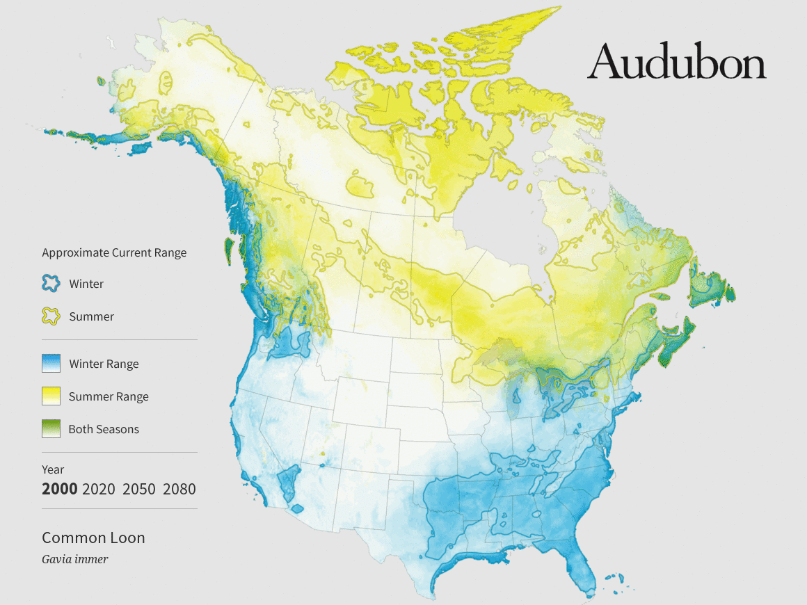
THE INTERNET’S CHIRPING: THE NEWEST ON CLIMATE CHANGE IS BIRD MAPS
This week the internet is going crazy about birds. The National Audubon Society released a 7-year study on climate change’s effects on bird population and people are listening. The report indicates that according to forecasting models a full half North American bird population will be threatened by 2080. That’s 314 species and includes birds in every state. The Audubon’s dedicated reporting site includes a picture of each bird with a climate forecast map looping from year 2000 to 2050 to 2080. The bright blue, yellow and green bring us through the changes in each bird’s livable area throughout the years during both summer and winter. Watching the map’s animation, it becomes clear how drastically each birds breeding range will shift.

Climate map for the Common Loon by National Audubon Society.
This map is presented in conjunction with a simple Venn Diagram to reinforce the shift. The two circles represent breeding range in 2000 and breeding range in 2080 with the overlap indicating the stable range that will remain the same. For the Allen Humingbird a large circle on the left and a tiny one on the right makes it very clear that this bird is seriously threatened – specifically with a projected 90% decrease in breeding range by 2080.

Venn Diagram of the Allen's Humingbird projected breeding range shift according to the National Audubon Society.
With all of these visualizations the Audubon has also mixed in large high-resolution images of birds in their habitats to catch our attention. The Audubon’s Senior Manager of Media Relations Agatha Szczepaniak notes that the heavy focus on visuals of the birds was part of an effort to increase understanding of the findings. Ultimately, the study is being used to inspire action and bright orange “Take action” buttons are fixed throughout the Audubon page. This means that even as you examine an animated map or click through high-resolution pictures of birds you’re also aware that your immediate action is needed.

Click here to take the pledge.
While the science and research here is the core of the study, it’s their use of visuals that really makes this study accessible and hopefully influential. It’s hard not to care about birds when the science is presented so obviously and strikingly.
Hats off to the National Audubon Society for using new media to get the internet to pay attention.